Elaine’s #18 – Monochrome in Prussian Blue.

August 21, 2012 by


I’m afraid my scanner cropped off part of this painting on both sides, I did this on 11 x 15 size and my scanner bed is max 8 1/2 x 11 (standard copy paper size)… so it looks a bit odd. What I liked on this was the sparkle I got using dry brush on the water… and I liked the clouds (hard to see on the scan so trust me the clouds are good) I’m not happy with the house across the water, looks odd, and I do not like the dolphin reflections… they are too dark and not broken enough as they would be on wind blown water. You can’t see it due to the cropping, but I was not happy with my attempts to add the overhanging tree branches… doesn’t really look like anything. All in all it was an interesting exercise that I enjoyed doing.

Oh My! It ha been an awfully long time…….

August 18, 2012 by

My case of internet avoidance seems to have gotten worse – I see that it’s been over a year since I posted here.  I do paint, and have been participating in online workshops with Richard Robinson this year, where I’ve learned a lot and had many ups and downs.  In the beginning, mostly downs as I measured myself against some of the fine painters on his site. I have gained in confidence though.

Here are some of the paintings which are randomly on my desktop right now.  One of the problems with not blogging for a while is the work involved in catching up – but I will try!

Elaine’s 16 & 17…

July 30, 2012 by

Elaine’s landscape #16

Did this while attended a Tony Couch workshop in Gainesville Georgia a couple of weeks ago.  Tony didn’t care for it much… but it still counts as number 16.

Elaine’s #17

Did this beach scene while at the same workshop.  Landscape number 18 has been sketched and will be a monochrome.  I need a LOT of practice and intend to paint more… my intentions so far hasn’t put any paint on paper… but no more excuses.  Time to fish or cut bait as they say.


Elaine’s #15 Colorado Sunset (first Pastel)

January 22, 2012 by

This is my very first Pastel painting, using PanPastels. It is on MiTienes paper size 11×14 I did this for a Challenge on the ID&P forum. Wish I’d had a brighter yellow and an orange as well as a violet… (more colors needed I see)… but over all I’m not too disappointed with my first attempt at pastels.

Elaine’s number 14 – A view of a Marsh

August 21, 2011 by

Low Country Marsh

Watercolor marsh… my office is across the street from a marsh area, so that I get to see the marsh and the birds every day… this marsh is based on that marsh… I was going to put an egret in this one, but didn’t leave a spot for it… next time I’ll add an egret or two.

Elaine’s number lucky 13

July 19, 2011 by

Elaine's #13

Elaine's #13


The shapes on this one were easy wedges… big swipes of color with a big flat brush with detail added after the initial wash dried. This painting is one of the exercises in a WetCanvas online class I’m taking.

Daffodils in the Rain

May 11, 2011 by

40 – and moving along

May 4, 2011 by

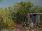
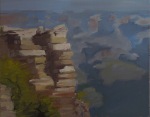
I’ve actually been painting lately, even though I’ve been mostly absent from the internet.  Trouble is, painting has not been going well for me in 2011.  I’m trying to paint my way through this bad patch though.  I’ve joined Matthew Archambaut’s Painting Tutorials Online  to try to improve my technique.  Matthew is an illustrator, and works in a very tight style which doesn’t correspond to my lazy and careless personality much, but I’ve been trying to apply myself.  Following are some small studies done from reference photos supplied on his site.  I was unable to make myself do an accurate underdrawing and underpainting – I just plowed in and refined as much as I could.  I think the Model T came out surprisingly well considering my sloppy approach, but I’m not thrilled with the other 2.  The point of these was the palette used. Here is one with a warm palette, one with a cool palette, one with a “broken palette” (basically 2 complementary colors – here I used blue and orange, apparently red and green work well too). Of course I cheated, adding yellow to obtain the green leaves.  I loved using the warm palette, didn`t really like the cool palette and hated the broken palette.  I think the results reflect that.

l

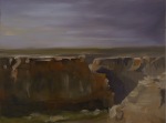
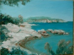
I also did one more version of that Loire scene – really that will be the very last one from that particular photo.  There will be more of the Loire since I live a stone’s throw away from it though. I followed Jill’s idea and cut out that damned island this time – it was the major problem in my composition.  This is also  tiny.  I haven’t had the nerve to work on a big canvas lately, but working so small creates other problems. This was extremely difficult to control, and I didn’t really get it.

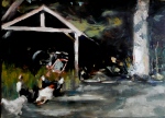
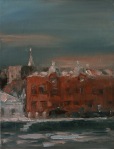
And as I had a lot of leftover paint after that one, I did a quick sketch based on a photo I took from my studio one evening last fall.  This took no more than 20 minutes and the colors are all wrong but I’m counting it because how else will I ever get to 100???  I may turn it into a painting at some point, but I’m not sure.

44!!!

Beach Palmetto Trees – Elaine’s #12

April 27, 2011 by

I messed up the clouds and sky on this one… so I just cropped the sky out of this… is that cheating?

Palmetto Trees on the Beach

Two quick oil studies from the same reference

April 15, 2011 by

I haven`t been doing much painting since getting stuck on N° 37 (below).   I hated that painting but could not work out what was wrong with it.  The more I worked on it the deeper I dug myself into a hole, but I was like a dog with a bone and just would not let it go! I tried changing the shape of the canvas (and a friend pointed out that I had unconsciously changed the poplar trees into pine trees – I have no idea where they came from!)  I have finally decided to move on and paint over my second attempt.  I`ve been working from a reference photo that just doesn’t have enough information and I don’t have the skill level to pull off a large painting with my imagination.  Anyway, to put this thing to rest I did two small oil studies yesterday working with a limited palette of blue and yellow, plus a little pre-mixed grey and white.  In one I kept to a warmer mix of colors, using cerulean, and in the other I tried to keep things cool, with a touch of alizarin in the blue. The underpainting shows through in both of them.  I may play around with another study combining the two color strings since they are already mixed up, but I will not be doing a large painting.  When I started this landscape series, the plan was to quickly do a whole lot of small studies, but I let myself get bogged down by being overly ambitious.  I really hope to pull myself out of this slump and get working again.

Here’s my reference photo, followed by the latest landscapes – 38 and 39. If you’d like to use the reference and paint one yourself, please feel free to do so.